Deep Red
#a70000
Creativity, challenge, fire, permanence.
Use: Primary brand color — headers, focal points, identity moments.
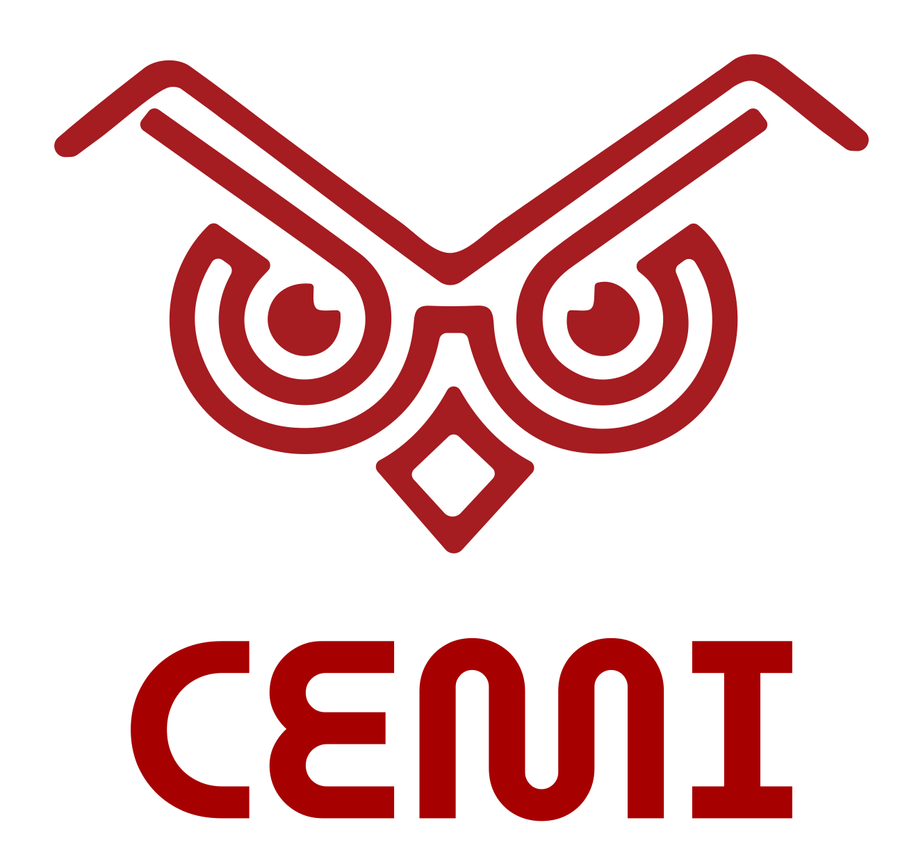
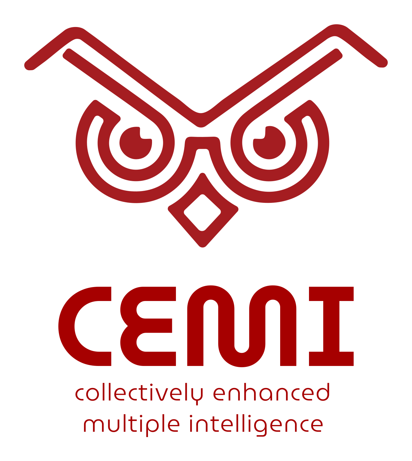
Our logo is a stylized, modern echo of how the ancestral cultures of Latin America and the Caribbean depicted two creatures: the owl and the bat. It combines the relief-carved eyes of the owl with the symbolic stroke of the bat's wings as rendered on three-dimensional physical objects.
Both the owl and the bat are creatures of the night, ancestrally tied to spiritual roles and to mystery, and both inhabit caves — known in the ancestral Caribbean cultures as the place of origin of humankind. Where in the Western tradition the owl represents wisdom, in ancient American cultures it played the role of messenger and link between the physical and spiritual worlds. Together, the two creatures represent the hybrid nature of CEMI as something alive, to be discovered, revealed, known, and brought to light.
Our representative visual element is the Búlago — an original creature that combines the bat and the owl into a new hybrid entity, endowed with vision and wisdom. The isotype combines the ancestral stroke of the bat (the upper line representing its wings) with the eyes of the owl. It is an attractive, powerful, and deeply meaningful visual element that captures who we are:
We studied the surviving record of how owls and bats were depicted by the Indigenous peoples of the Dominican Republic, Puerto Rico, the Virgin Islands, and the wider Caribbean. The owl-and-bat motif appears across petroglyphs, cave paintings, and three-dimensional ceramic and stone objects of the Taíno world — both creatures understood as messengers between the physical and spiritual realms.
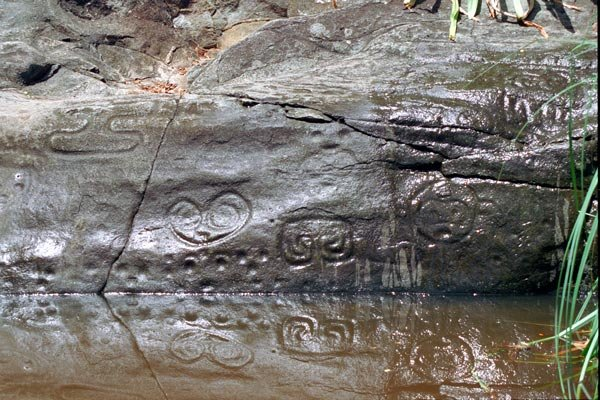
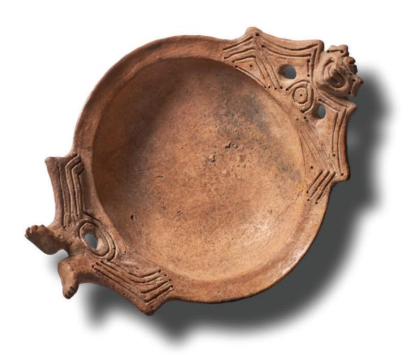
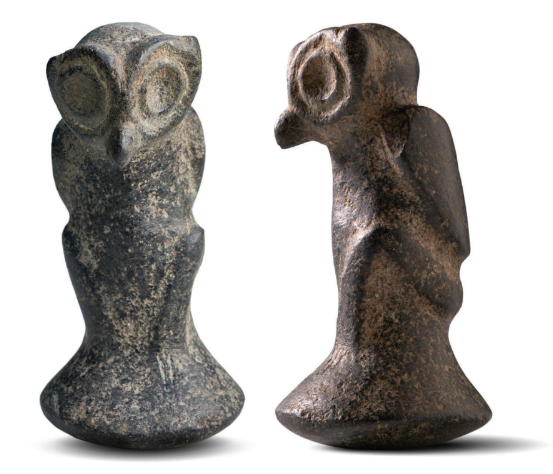
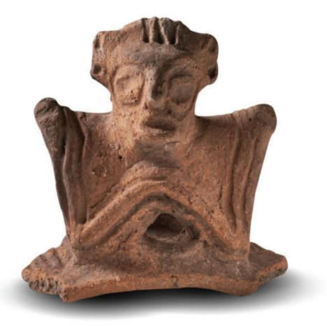
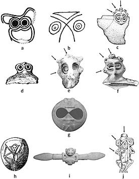
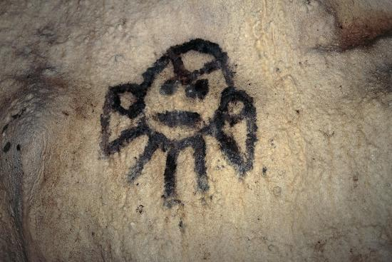
The fusion of two distinct creatures into a single, coherent entity represents the transformative potential of integrating diverse intelligences. The Búlago's abstract-but-recognizable form mirrors our approach to combining the familiar (human intelligence) with the new and not-yet-fully-known (artificial intelligence) to produce something genuinely future-oriented.
Its symmetry communicates duality and balance — a central theme at CEMI — and its bold geometric lines make it memorable across media and contexts.
A deliberate detail: the Búlago's eyes are subtly crossed, with small white reflections in the inner upper corners. This is a visual metaphor for the dual nature of our mission:
The Búlago is designed to remain recognizable across media and contexts. Two stylized variants coexist — a single-line and a two-line form — for use depending on scale and substrate.

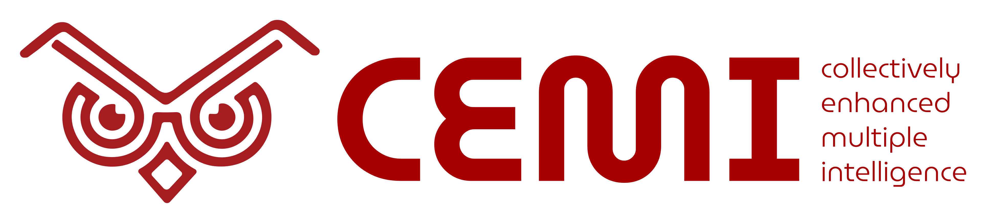
Our primary color is a deep red (#a70000) that echoes the malleable clay used by our ancestors to create the first cave paintings by firelight — creativity, challenge, fire, permanence. Around it we built a palette that pairs earth tones with colors of nature, wisdom, and a forward-looking vision.
#a70000
Creativity, challenge, fire, permanence.
Use: Primary brand color — headers, focal points, identity moments.
#D9A441
Earth, warmth, the natural world. Widely used in ancient cave paintings.
Use: Secondary highlight, backgrounds, accents that evoke heritage.
#2F4F6F
Intelligence, wisdom, calm. Clarity of thought.
Use: Innovation, technology, secondary headers and buttons.
#4B775A
Nature, growth, harmony, renewal, balance.
Use: Support backgrounds and visual elements; growth and sustainability sections.
#A67F5B
Stability, tradition, ancestry. The clay of ancient artifacts.
Use: Background colors, borders, subtle details that create depth and history.
#E0CBA8
Softness, balance, versatility.
Use: Backgrounds, text highlighting, visual pauses in dense content.
Lead with deep red and ochre for emphasis and grounding; blue and green carry intelligence and modernity.
Deep cobalt blue against warm clay brown or neutral sand draws attention without overwhelming.
Yellow ochre is the warmth-and-attention color — calls to action, key information.
Earth green for calm and balance, especially in sections that touch nature, growth, or sustainability.
Our type system rests on two complementary fonts that share a common geometric root: MuseoModerno for display and identity moments, and Inter for body text and extended reading. Both are freely distributed under the SIL Open Font License and available on Google Fonts.
CEMI · Collectively Enhanced Multiple Intelligence
Designed by Pablo Cosgaya, Héctor Gatti, and Marcela Romero of the Omnibus-Type team for the visual identity of the Museo de Arte Moderno de Buenos Aires, MuseoModerno is a geometric typeface inspired by the 20th-century European avant-garde. We use it for graphic titles, visual highlights, and identity moments where we want brand presence to lead. Its Latin American origin reinforces our cultural connection to the region; its clean geometry balances the symbolic, organic lines of the Búlago.
Inter was designed by Rasmus Andersson for one purpose: to make on-screen reading as comfortable as well-printed paper.
Inter shares MuseoModerno's geometric DNA but adds the humanist warmth needed for extended reading. We use it for headings inside text, body copy, captions, interface elements, and tabular data. Its 2,000+ glyphs cover the multilingual surface of CEMI's communication (Spanish, English, French, Portuguese, plus accurate rendering of Indigenous-language terms).
| Context | Typeface | Why |
|---|---|---|
| Graphic titles and highlights | MuseoModerno | Visual impact, brand identity, cultural connection |
| In-text titles and subheadings | Inter SemiBold / Bold | Clear hierarchy, legibility, geometric continuity |
| Body copy | Inter Regular | Fluid reading, on-screen clarity, visual comfort |
| Notes and secondary text | Inter Light | Subtle hierarchy, functional elegance |
| Numerical data and tables | Inter Tabular | Precise alignment, rigor in data presentation |
| Buttons and interface | Inter Medium | Presence without competing with display elements |
Everything below is free to use to identify or link to CEMI — press, partner and sponsor materials, decks, event collateral. The complete archive includes the usage rules and both font licences.
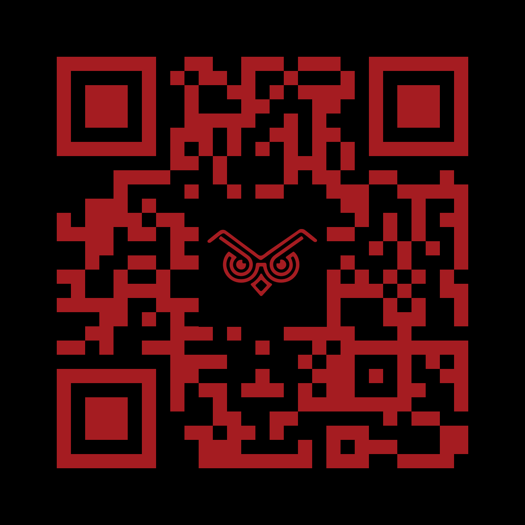
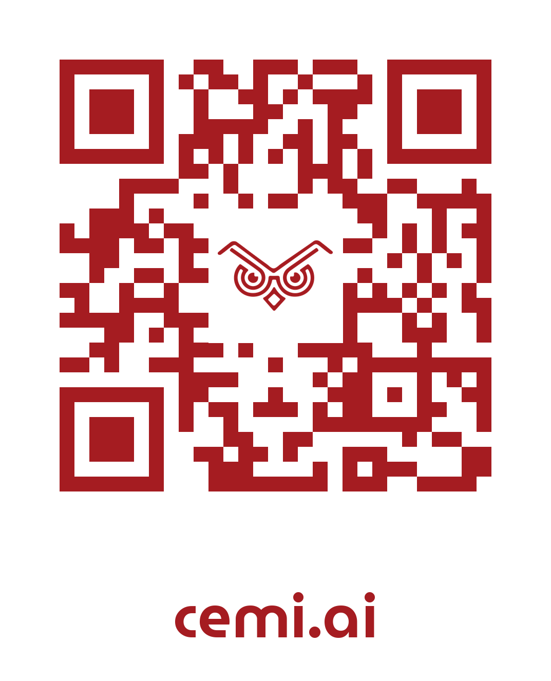
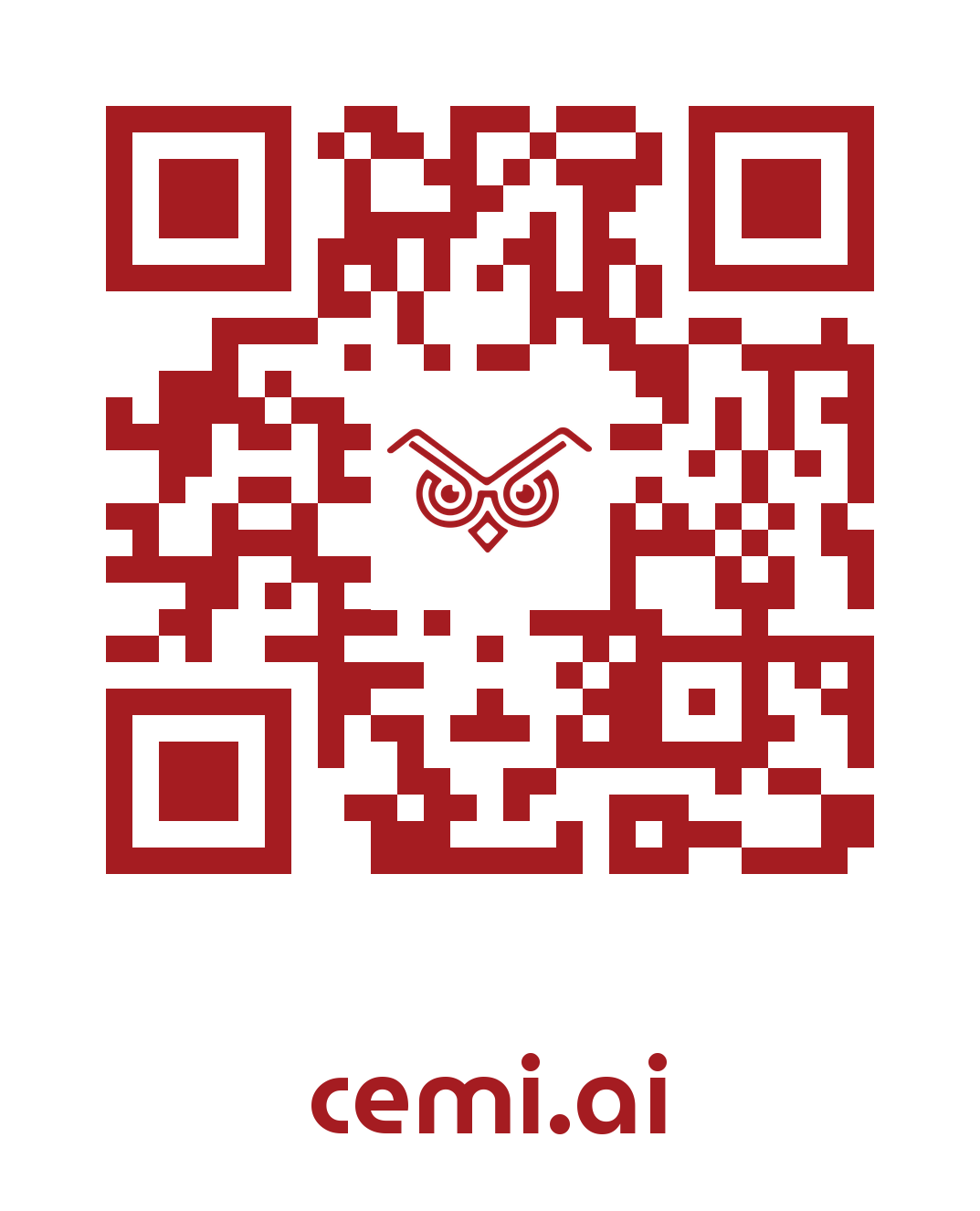
All fourteen encode https://cemi.ai and carry the Búlago at their centre. Choose the contrast that fits your substrate; the transparent variants sit on any solid colour.
MuseoModerno for display and headings, Inter for body and interface. Both are SIL Open Font License 1.1 — free to use, embed and redistribute, provided the licence text travels with the files.